ThoughtFocus —
From Legacy IT Vendor to Modern B2B Brand & AI Powerhouse
A comprehensive brand and digital experience overhaul for a 22-year-old, 3,000+ employee US enterprise technology firm—restructuring the 36-intersection dual-track IA, launching the Pervasive AI Lab narrative, and establishing a scalable enterprise design system for global Fortune 100 enterprise buyers.

A complex 3,000-person enterprise firm that looked like a generic IT vendor online
By 2022, ThoughtFocus had grown into a global technology force: 22+ years in business, over 3,000 associates, and 90%+ client retention serving Fortune 100 institutions across Financial Services, Payments, Capital Markets, and Hi-Tech Manufacturing. Yet their online presence completely masked that institutional power.
The existing digital footprint suffered from the classic "Generic IT Vendor Syndrome": vague terminology, generic stock photography, and a single flat navigation dropdown that buried capabilities 4 to 5 clicks deep. Enterprise procurement teams, CIOs evaluating SLA risk, and CTOs assessing AI readiness had no clear pathway into the firm's true capabilities. The site was actively creating friction during multi-million-dollar RFP cycles.
Brand Positioning Slump
The legacy site relied on ubiquitous tech stock imagery and buzzword-heavy copy that could have belonged to any low-cost offshore outsourcer. ThoughtFocus needed to communicate elite institutional credibility in AI, Financial Engineering, and mission-critical cloud migrations.
The 6×6 Information Architecture Trap
With 6 core service lines (AI, Consulting, Cloud, Data, Engineering, Operations) and 6 specialized industries (Banking, Payments, Lending, Capital Markets, Insurance, Manufacturing), buyers were trapped in a 36-intersection maze with no direct entry point.
Absence of Mobile Buyer Journeys
Over 42% of preliminary enterprise research and C-suite reference checks now originate on mobile devices during conferences or executive reviews. The legacy site broke on small viewports, with unreadable tables and inaccessible navigation trees.
The transformation in one frame
Comparing the 2022 legacy web presence against the redesigned enterprise portal. The evolution goes far beyond visual aesthetics—it represents an architectural paradigm shift from commodity vendor to strategic enterprise partner.
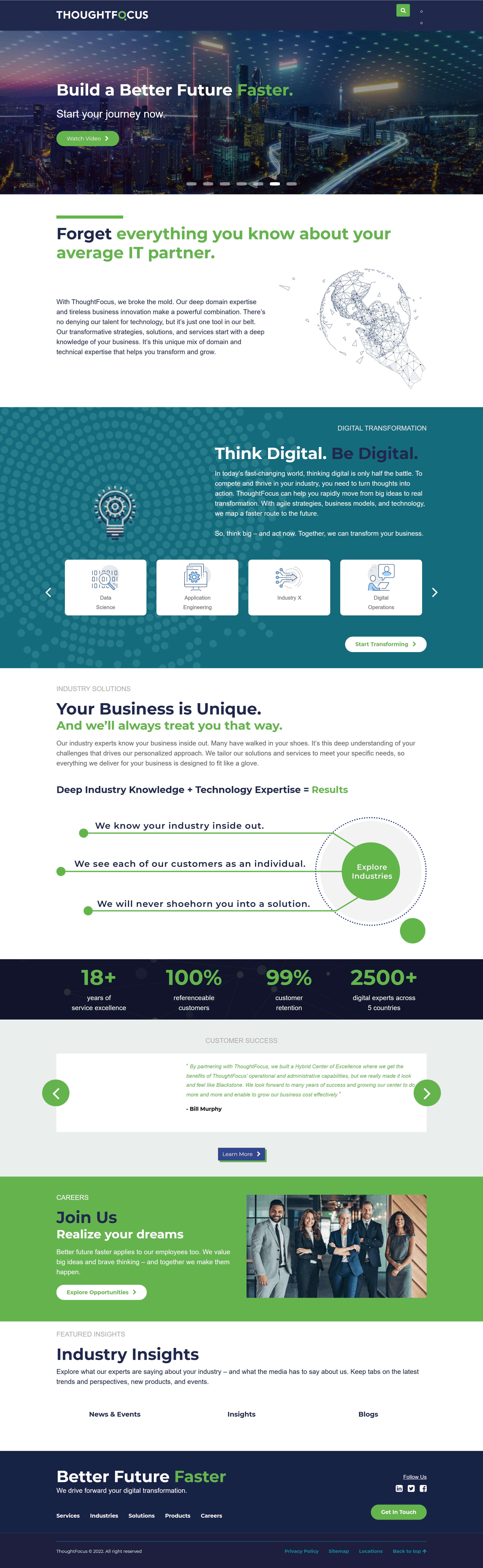
- Flat single dropdown burying critical service offerings.
- Generic stock photos with no authentic brand differentiation.
- Vague category naming (e.g., "Industry X") that confused procurement officers.
- 4 to 5 clicks required to locate domain-specific case studies.
- Dual-track mega navigation (Industry-first & Capability-first).
- Editorial art direction with bold green accents and authoritative dark panels.
- Pervasive AI Lab spotlighted directly on the front fold.
- 2 clicks maximum to reach any of the 36 service-industry intersections.
How we executed over a 4-month sprint
Operating as the UX Strategy Lead with a tight team of four designers and executive steering committee oversight, we deployed a structured, milestone-driven framework that prioritized IA validation before visual layout generation.
Discovery, Taxonomy Audit & Heuristic Analysis
Conducted a full heuristic audit across all 110+ legacy pages, cataloging every service, industry capability, and downloadable whitepaper. Benchmarked ThoughtFocus against tier-1 enterprise peers (EPAM, Thoughtworks, Cognizant) to identify gaps where ThoughtFocus could own specialized B2B positioning in AI and Financial Services.
Information Architecture & Dual-Track Mega-Menu Engineering
Rather than forcing users into a single linear hierarchy, we structured two parallel buyer entry tracks: Industries (for vertical buyers like Heads of Banking, Insurance, and Lending) and Services (for technical buyers like CTOs evaluating Cloud, AI, and Data Engineering). This structural decision reduced discovery click-depth by over 55%.
Page Archetypes & Component-Driven Design System
Rather than designing 80 bespoke pages, we engineered 4 core master page templates (Homepage, Industry Vertical, Service Capability, and About/Corporate). We established a reusable design system in Figma with atomic components, stats strips, testimonial cards, and responsive tab sets—enabling seamless handoff to engineering.
Section-by-Section Governance & Executive Consensus
To avoid the dreaded "infinite revision loop" with multi-department enterprise stakeholders, we decoupled layout validation from copywriting. Reviews were conducted per content module (Hero, AI Spotlight, Client Proof, Industry Solutions) rather than full-site dumps. The homepage passed executive steering sign-off in a single revision cycle.
Rebuilding the navigation logic for dual-intent buyers
Enterprise buying groups are inherently multi-disciplinary. A Chief Risk Officer in Banking enters with vertical compliance requirements; a VP of Cloud Engineering enters looking for Databricks migration credentials. The dual-track mega-menu delivers immediate context to both without navigational dead-ends.
The Mega-Menu as a Strategic Product Architecture
Some initial stakeholders argued for a simple, minimal dropdown to keep the interface "clean." We successfully demonstrated that flattening the menu would hide the company's multi-disciplinary depth. The resulting 4-panel system treats navigation as an executive discovery surface.

Sector-First Intent
Direct entry for Banking, Payments, Mortgage, Capital Markets, Insurance, and Manufacturing buyers.
Capability-First Intent
Direct entry for CTOs evaluating AI, Cloud Architecture, Data Governance, and Digital Operations.
Instant Credibility
Thought leadership, case studies, and engineering whitepapers surfaced directly at navigation level.
Institutional Trust
22-year milestone history, leadership bios, and global delivery footprint front-and-center for procurement.
Structural layout systems before visual styling
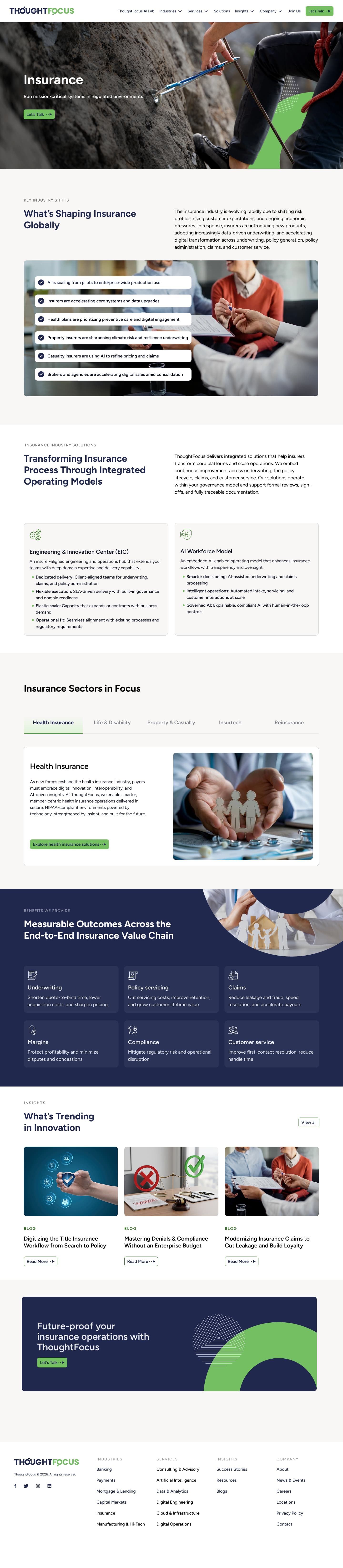
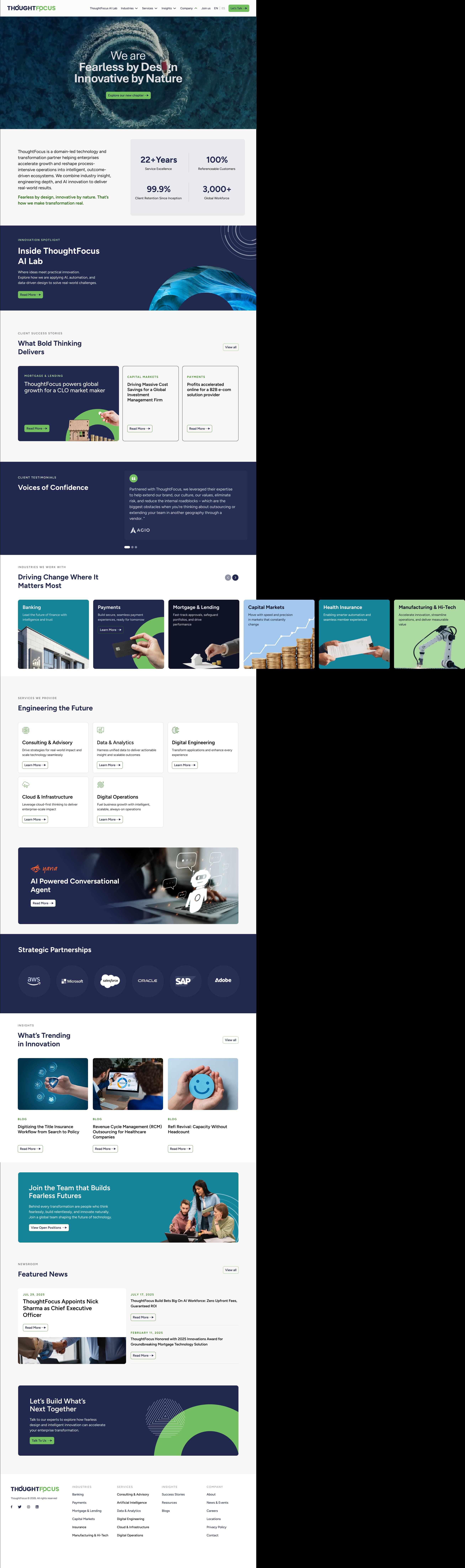
Before opening Figma for high-fidelity styling, we codified the structural hierarchy for the two primary templates that govern 80% of user traffic: the Modular Homepage and the Industry Vertical page.
The Pervasive AI Lab: Positioning AI at every layer
A critical strategic objective of the redesign was breaking away from commoditized "AI buzzwords." We partnered with executive leadership to formalize the Pervasive AI Framework—demonstrating that ThoughtFocus embeds intelligence into foundational workflows, data infrastructure, and operational loops rather than treating AI as a superficial chatbot plugin.

Domain-Led Insight
Intelligence shaped by banking and regulatory context.

Engineering Depth
Enterprise Databricks & cloud production pipelines.

Agentic Innovation
Autonomous multi-agent execution with human oversight.

Measurable ROI
Accountable to SLA cycle time and cost efficiency.


The 4 Master Templates powering 80+ enterprise pages
By distilling the site's extensive surface area into 4 rigorously documented master page templates, the design team was able to support rapid content authoring across 6 business units without generating technical or design system debt.


Client voices: Backing claims with enterprise evidence
Rather than burying testimonials in a footer carousel, the new architecture integrates verified institutional quotes from major financial partners directly into relevant service and industry pathways.
"ThoughtFocus has been an exceptional strategic partner to Angel Oak Capital Advisors. Their ability to seamlessly support multiple business functions has amplified our capabilities and accelerated our growth. Their unmatched responsiveness and deep commitment make it clear they are genuinely invested in our success."

"Our relationship with ThoughtFocus began with two resources on a specific set of responsibilities where they showcased their abilities. Since then, we have expanded our relationship to multiple areas of our back-office operations. Deerpath is delighted to have ThoughtFocus as a valued partner."

"Afero has been collaborating with ThoughtFocus for 3 years. ThoughtFocus' flexibility and collaborative approach, from team to leadership, have enabled tight integration, expanding our bandwidth and allowing us to deliver at enterprise scale and speed."

Measurable outcomes delivered by the redesign
The redesigned digital platform launched to unanimous internal stakeholder approval across all six business units—marking the first time in company history that a major brand overhaul passed corporate steering committee review in a single revision cycle.
36 Intersections Mapped
All 36 service-industry pathways are navigable in 2 clicks or fewer, down from 4–5 clicks previously.
Master Page Templates
Unified 80+ pages under 4 atomic design templates, saving 3–4 weeks of engineering implementation time.
Executive Steering Sign-Off
Section-by-section modular review cycles eliminated revision thrash; homepage passed on initial submission.
Enterprise Retention Communicated
Positioned 22 years of delivery and 3,000+ global innovators to actively support enterprise sales cycles.
Design leadership reflections: What I learned
Every large-scale enterprise redesign leaves valuable institutional wisdom. Here are the core insights I carried forward into subsequent enterprise design engagements:
Start with an IA Whiteboard Artifact, Not Figma Frames
Early in the project, there was executive eagerness to jump straight into high-fidelity visuals. Resisting that urge to produce an explicit, tree-tested Information Architecture map saved weeks of potential structural rework. By resolving the 36 service-industry intersections on a whiteboard first, our Figma work became pure system execution rather than debate over page hierarchy.
Wireframes, Even Rough Ones, Prevent Content Paralysis
On enterprise projects with multiple service line leaders, reviewing high-fidelity screens invites micro-critiques about colors and button shapes when the team should be aligning on content hierarchy. Presenting mid-fidelity structural wireframes allowed stakeholders to react purely to information density and messaging priority before aesthetic decisions were locked.